
Denden
DENDEN Youth Development Association of Minnesota is a nonprofit organization devoted to uplifting East African–American youth and families across the Twin Cities. With programs spanning mentorship, enrichment activities, and community events, DENDEN creates safe, supportive spaces where young people can thrive, cultivate leadership skills, and connect deeply with their cultural heritage. Their mission is to foster resilience, pride, and opportunity—helping families feel seen, heard, and empowered.
Project Overview
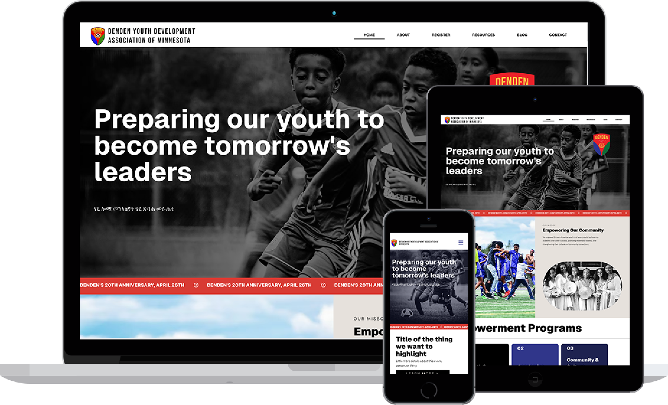
When DENDEN partnered with us to launch their very first website, the goal was clear: translate their vibrant, community-driven spirit into an online experience that welcomed families and strengthened trust. We began with a logo refresh and in-depth market research to understand how local nonprofits communicate impact; that insight guided a new color palette and typography system rooted in warmth and professionalism. From there, we crafted a streamlined site structure on Wix—mapping intuitive navigation for parents, youth, and partners—then wove in SEO best practices so DENDEN would surface in local searches. Art direction and real photography took center stage, capturing the energy, joy, and resilience of DENDEN’s programs. Throughout, our content strategy, UX/UI design, and brand-expansion efforts ensured every page tells DENDEN’s story authentically, inviting visitors to learn, engage, and join the journey.
Services Provided
Competitive/Comparative Analysis
Logo Refresh
Brand Expansion
Content Strategy
User Experience Design
User Interface Design
Logo
Denden wanted to preserve the overall integrity of their existing logo while giving it a cleaner, more modern feel. To achieve this, I kept the original shield shape and color palette but deepened and refined the tones for a bolder, more professional look. I reworked the typography to establish a clear hierarchy, making “Denden” the most prominent element, while simplifying the supporting text for clarity. The soccer ball with olive branches was redesigned into a streamlined, icon-like mark that balances tradition with simplicity.
The result is a refreshed logo that honors the original intent while presenting a polished, versatile identity. The client was very pleased with the update, noting that it retained the heart of the original design while feeling more modern and cohesive.
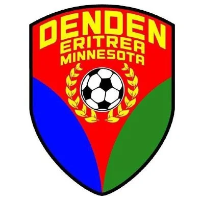
Before
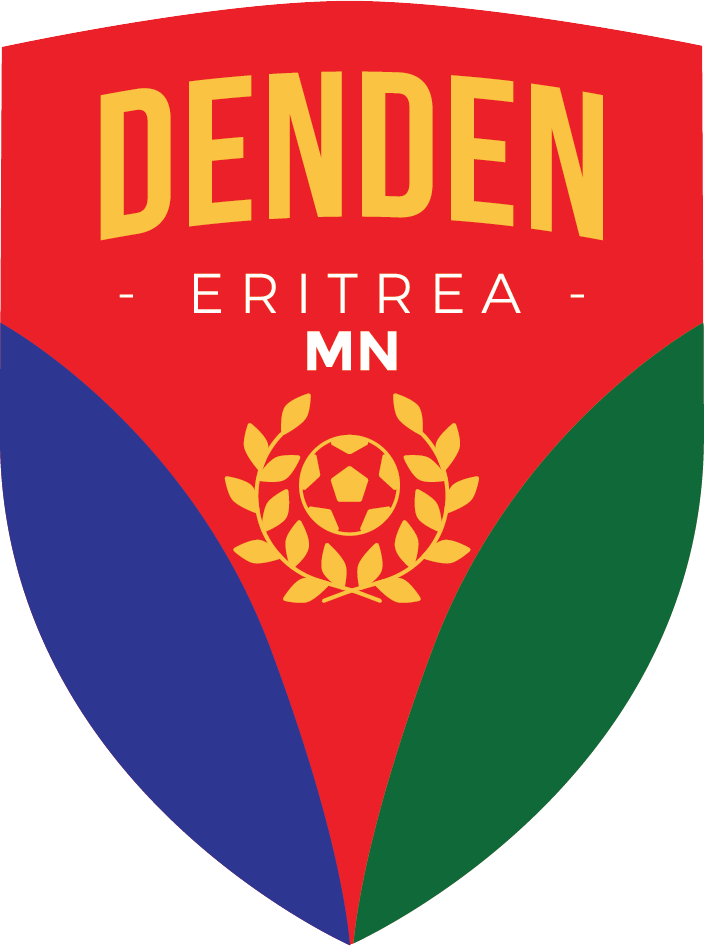
After
FONTS
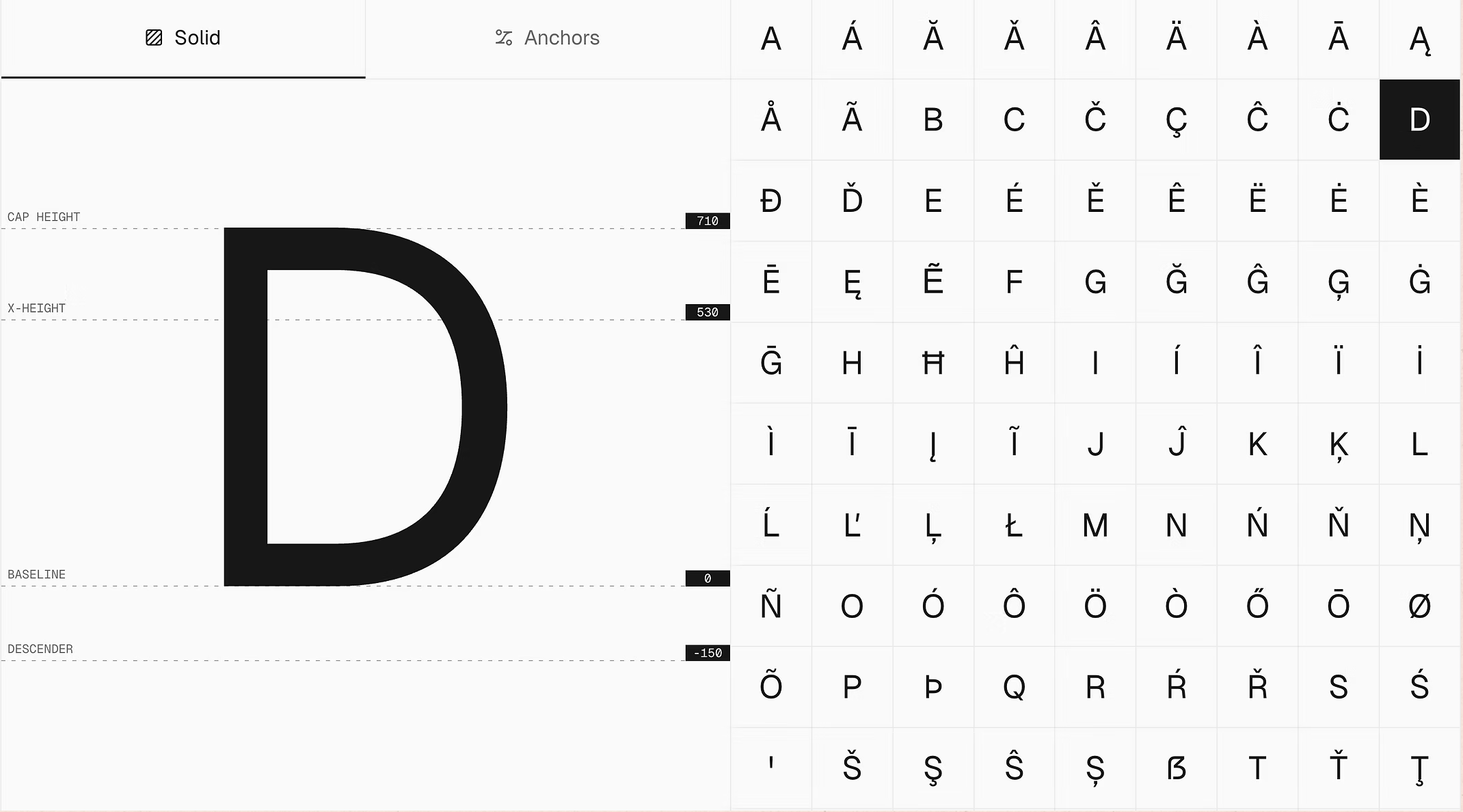
Geist Font Family
For Denden’s refreshed brand, I selected the Geist Font Family because of its bold, modern, and versatile qualities. The font strikes the perfect balance between strength and clarity, reflecting the organization’s mission of empowering Eritrean-American youth while keeping the design clean and approachable.
Colors
Hex: #000000
Hex: #30368A
Hex: #E5E1DC
Hex: #EAEAEA
Hex: #D93B34
Check out